
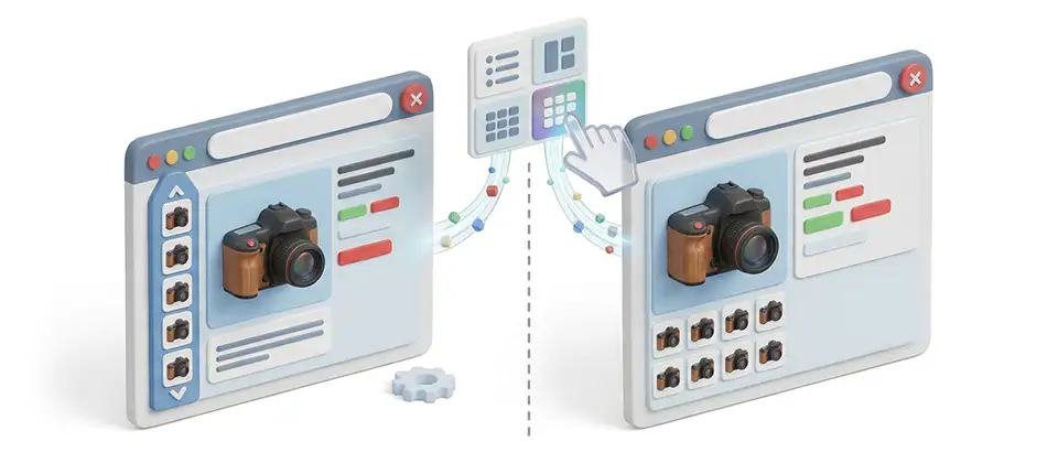
You Shot Twelve Photos. Your Shopper Sees Four.
They're crammed into a strip the width of a business card, dimmed like they're already sold out, waiting behind a sideways drag nobody performs. Four photos are doing the work of twelve. You paid for twelve.
Every Photo You Paid For, Actually On Screen
Three layouts, tunable brightness, separate mobile behavior, and a per-product override for the items that deserve special treatment.
Grid Below the Main Image
Every thumbnail visible at once, in tidy rows. No scrolling, no hidden photos, no shopper deciding your product only has four angles because four is all they could see.
Vertical Strip Beside the Photo
A tall column of thumbnails running down the side of the main image — the layout every large retailer trained your shoppers on years ago. Your store, finally speaking the same language.
Thumbnails Per Row, Your Call
Three fat, generous previews or eight tight ones. Set the desktop count, then set a completely different count for phones so mobile thumbnails stay big enough to hit with a thumb.
Stop Photos Looking Disabled
Thirteen brightness levels for unselected thumbnails. Pull the ghosting up until your bright studio shots read as clickable instead of greyed out and unavailable.
Hover Feedback They Can Feel
Thumbnails lift and brighten under the pointer by exactly the amount you choose. Thirteen more levels. Subtle nudge or full spotlight — pick your personality.
Arrows, For the Literal-Minded
Add previous and next buttons so nobody has to guess whether there's more to the left. Shoppers click arrows. It's about the only interaction the entire internet agrees on.
Side Strip Sized to Fit
Six column widths and a choice of how many thumbnails stack before it scrolls, so the strip lines up with your main image instead of dangling past the bottom like a loose thread.
Narrow Screens Get a Plan
Decide whether the vertical layout starts at tablet or stays desktop-only, and choose exactly what it becomes below that. A grid, or the classic scroller. Never a crushed column.
Override Any Single Product
Your flagship item with twenty photos gets the grid. Your two-photo accessories keep the scroller. Set the house style once, then break it exactly where breaking it earns money.
Survives a Variant Swap
Shopper picks a different color, the photo set changes, and your layout comes back with it. Grid stays a grid. Vertical stays vertical. Every time, not just the first time.
Usable By Everybody
Thumbnails are real buttons — reachable by keyboard, activated with enter, announced as "show image 3 of 12" instead of a dead-end filename. Motion-sensitive shoppers get a calmer gallery automatically.
Weightless Until You Use It
Leave it on the built-in scroller and nothing is added to your page. No styling, no script, no extra markup. Not one byte until you actually ask for a different layout.
The Three Decisions That Change Everything
Show Every Photo At Once. Radical, We Know.
Switch to the grid and the cramped rail disappears, replaced by clean rows sitting under the main image where every single thumbnail is visible without a drag, a swipe, or an act of faith. Twelve photos, twelve visible thumbnails.
A shopper who can see that you took twelve photos already believes you care about the product. That's a sale started before they've read a word of the description.
Your Thumbnails Aren't Broken. They Just Look It.
Dimmed thumbnails are supposed to say "not selected." On bright studio photography they say disabled — the universal web signal for "this thing does not work." So shoppers stop clicking, and your gallery has successfully taught them to ignore it.
Two dropdowns fix it. Pull the idle brightness up, set the hover response, and every thumbnail reads as live. No stylesheet, no developer, no argument with anybody's theme.
Break the Rules on Exactly One Product
Every store has three products that deserve the full showcase treatment and two hundred that absolutely do not. Set your store-wide layout once, then override any setting on a single product without touching the rest of the catalog.
The hero item gets the six-across grid. Everything else keeps following the house style, automatically, forever. Simple math.
Stores That Stopped Hiding Their Own Photography
You Already Paid For All Twelve Photos.
Stop letting a four-thumbnail strip decide which ones your shoppers are allowed to see. Pick a layout that shows the work, dial the brightness so nothing looks broken, and give your best products the showcase they earned.
Show all twelve. It just works.
Translated In The Following Languages
Arabic Unitag (ar-AA), Chinese, Traditional (zh-TW), Danish (da-DK), Dutch (nl-NL), English (en-GB), English, USA (en-US), Finnish (fi-FI), French (fr-FR), German (de-DE), Greek (el-GR), Hebrew (he-IL), Italian (it-IT), Japanese (ja-JP), Norwegian Bokmål (nb-NO), Persian Farsi (fa-IR), Polish (pl-PL), Portuguese, Brazil (pt-BR), Portuguese, Portugal (pt-PT), Russian (ru-RU), Spanish (es-ES), Swedish (sv-SE), Turkish (tr-TR)
License Information
An active license entitles you to updates, downloads, and support for the duration of the license period. You may continue using this plugin indefinitely without an active license; however, support, updates, and downloads will not be available while your license is inactive.
- Developer J2Commerce
- Extension Type Apps
- J2Commerce Version 6.x
- Joomla Version 6.x
 Arabic Unitag
 Chinese, Traditional
 Danish
 Dutch
Dutch English
 English, USA
 Finnish
 French
 German
 Greek
Greek Hebrew
 Italian
 Japanese
 Norwegian Bokmål
 Persian Farsi
 Polish
 Portuguese, Brazil
 Portuguese, Portugal
 Russian
 Spanish
 Swedish
 Turkish
New Feature Initial release: three thumbnail layouts (horizontal scroller, grid, vertical strip) for the product gallery
New Feature Add adjustable idle and hover opacity for unselected thumbnails
New Feature Add optional previous/next arrows on the thumbnail strip
New Feature Add a per-product override on the App tab that beats the store-wide setting
Update Requires Joomla 6.x + J2Commerce 6.x
You may also be interested in these products


Stay Updated
Subscribe for free and be the first to know about the latest features, updates, and new additions.