Brand Kit
Download the J2Commerce logo and brand guidelines.
This page has the logo files, the correct spelling of the product name, the brand colors and the typeface. Use them as supplied, without changing the logo or the name.

Logo Files
The logo comes in SVG and PNG files, each with one version for light backgrounds and one for dark backgrounds. Use the SVG files wherever you can, and the PNG files where SVG is not supported.

j2commerce-logo.svg is for light backgrounds. “J2” is royal #344CB7 and “Commerce” is navy #000957.
j2commerce-logo-dark.svg is for dark backgrounds, shown here on navy. “J2” is periwinkle #8EA6E6 and “Commerce” is white.Logo Downloads
- Logo for light backgrounds (SVG, 5 KB)
- Logo for dark backgrounds (SVG, 5 KB)
- Icon only, for favicons and app icons (SVG, 1 KB)
- Logo for light backgrounds (PNG, 2758 × 564, 336 KB)
- Logo for dark backgrounds (PNG, 2758 × 564, 252 KB)
- Icon only, for favicons and app icons (PNG, 1024 × 1024, 162 KB)

#344CB7 rounded square with a white cart, speed lines and one yellow #F5D90A speed line.Old Logo Files
Stop using j2commerce.png, j2commerce-original.png and any white version made with a CSS filter. Replace them with the current SVG or PNG files.
-
Logo Clear Space
Leave empty space around the logo at least as tall as the cart’s wheel, on every side. Keep text, images and card edges out of that space.
-
Logo Sizes on Our Site
In the j2commerce.com header the logo is 40px tall (about 196px wide), or 32px tall on screens narrower than 400px. In the footer it is 220px wide.
-
Logo Backgrounds
Use the light file on light backgrounds and the dark file on dark backgrounds. Do not place the logo on a photo or a mid-tone color.
How to Spell J2Commerce
J2Commerce is one word: a capital J, the numeral 2, a capital C and the rest in lowercase. It is never written in all capitals.
A version number follows the name after a space: J2Commerce 6, J2Commerce 6.6.3. The lowercase com_j2commerce appears only in code.
| Use this | Not this | Why |
|---|---|---|
| J2Commerce | J2commerce | The C is a capital. |
| J2Commerce | j2commerce | All lowercase is only for code and file names. |
| J2Commerce | J2COMMERCE | The name is never set in all capitals, even in headings. |
| J2Commerce | J2 Commerce | It is one word, with no space. |
| J2Commerce, LLC | J2Commerce LLC | The company name includes the comma. Use it in contracts and credits. |
Copyright Line
Use this copyright line exactly, with the current year:
© 2026 J2Commerce, LLC. All rights reserved.How Not to Use the Logo
Use the logo files as supplied. Each change shown here is not allowed.
-
Stretching or Skewing
Do not stretch, squash or skew the logo. When you resize it, keep the width and height in proportion.
Do Not
-
Recoloring or Filters
Do not change the logo’s colors or apply a CSS filter to it. On a dark background, use the dark file.
Do Not
-
Effects
Do not add a drop shadow, glow, bevel, gradient, outline or photo filter.
Do Not
-
Rebuilt Wordmark
Do not retype the wordmark in a font. Use the supplied vector file.
Do Not
-
Photo or Mid-Tone Backgrounds
Do not place the logo on a photo or a mid-tone color. Use a plain light or plain dark background with the clear space intact.
Do Not
-
Combined Logos
Do not merge the logo with another logo into a single badge. Keep clear space between them.
Do Not
-
Implied Endorsement
Do not say J2Commerce approves or endorses a product unless it does. “Works with J2Commerce” is fine.
Do Not
Brand Colors
The brand uses four colors: navy #000957, royal #344CB7, periwinkle #577BC1 and yellow #F5D90A.
On a typical page, about 80% is neutral (off-white, white and navy text), 15% is navy panels and royal-tinted surfaces, and 5% is royal buttons and links. Yellow appears only in small accents.
For developers: each color is a --template-* CSS custom property mapped to a Bootstrap variable, with one value for light mode and one for dark mode.
| Name | Hex | RGB | Where it is used |
|---|---|---|---|
| Navy | #000957 | 0, 9, 87 | Headings, dark surfaces (announcement bar, dark panels, footer) and dark buttons |
| Royal | #344CB7 | 52, 76, 183 | The primary color: logo, primary buttons, links, focus rings, small labels above headings and icon squares |
| Periwinkle | #577BC1 | 87, 123, 193 | Fills, glows, tints and borders only. Never text, because it has only 4.19:1 contrast on white. |
| Yellow | #F5D90A | 245, 217, 10 | On navy only: small tags, labels on dark panels and single icon tiles. Never on a light background, where its contrast is 1.4:1. |
| Role | Light mode | Dark mode |
|---|---|---|
| Page background | #F7F8FD | #060B33 |
| Surfaces (header, cards, tiles) | #FFFFFF | #0B1244 |
| Alternate background | #EEF1FB | #0B1244 |
| Body text | #1B2150 | #DEE2E6 |
| Headings | #000957 | #FFFFFF |
| Secondary text | #4A5075 | #A9B3CF |
| Borders and dividers | #E1E5F2 | #1D2766 |
| Secondary text on navy | #B8C2E0 | #B8C2E0 |
Typeface and Corner Radius
J2Commerce uses Geist Variable for the website and all documents. The wordmark in the logo is Geist Black, converted to vector shapes. Geist is free under the SIL Open Font License, and one variable font file covers every weight.
We host the font on our own server instead of loading it from a font service. If it does not load, the browser uses the system interface font.
Type Scale
| Role | Weight | Notes |
|---|---|---|
| Page headings | 700 | Tight letter spacing, sentence case, and at most one phrase in royal. |
| Section headings | 700 | Short, with an optional small label above. |
| Buttons | 600 | Every button label is in Title Case. |
| Small labels above headings | 700 | 0.8125rem, uppercase, 0.1em extra letter spacing. Royal, or yellow on navy. |
| Body text | 400 | 1.6 line height, with lines kept to about 68 characters. |
Corner Radius
Every element has a 4px (0.25rem) corner radius: buttons, inputs, chips, cards, tiles, images, screenshots, call-to-action cards, dark panels, dropdowns and badges. There are no softer or pill-shaped variants. Only radio buttons and toggle switches are round.
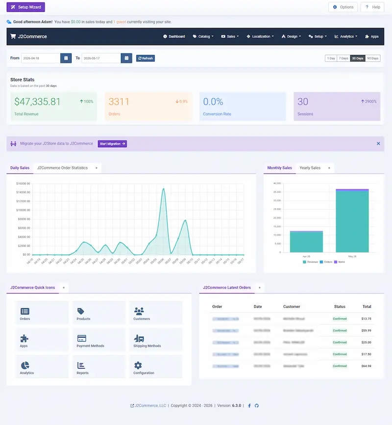
Screenshots You Can Use
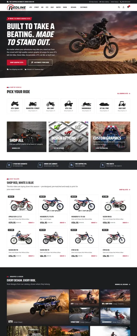
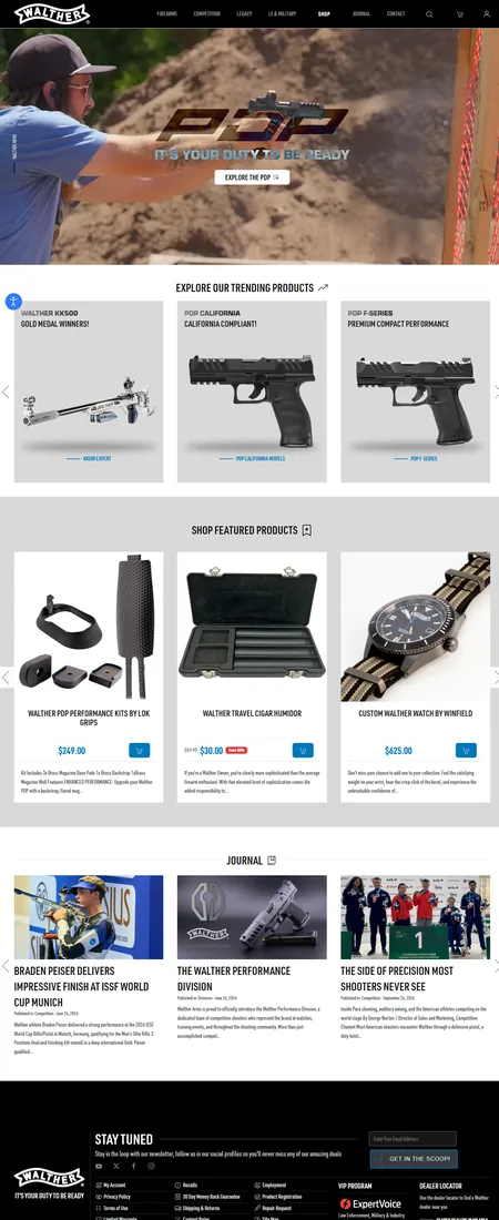
Screenshots of the current release and of customer stores from the showcase page.
Using Customer Store Screenshots
The stores on the showcase page are live customer stores. When you show one, name the store and link to it. Ask us before you use one in an advertisement. We do not publish revenue or traffic figures for these stores.